DATA visualization

We visualize SGA and QFA data using interactive graphs in R (as a visualiztion tool in our open source QFA package) and online DIXY (Dynamic Interactive XY plot).
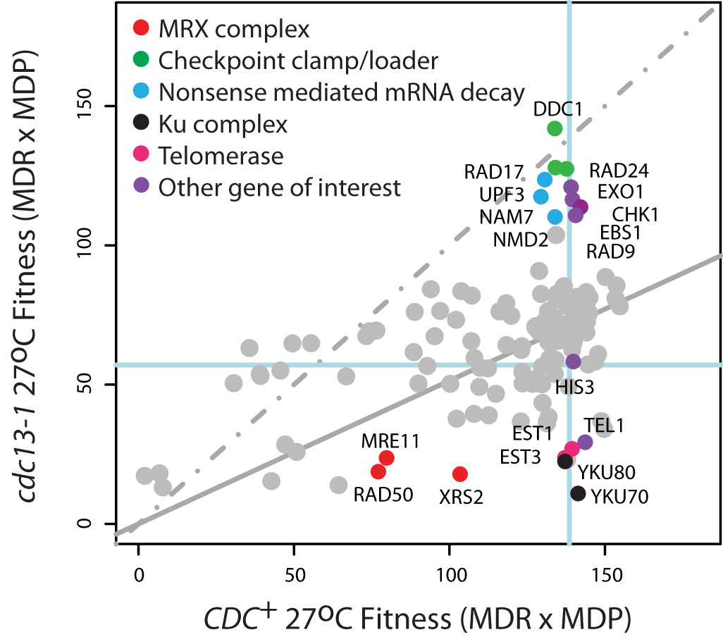
QFA of telomere-defective cdc13-1 strains. Strains with cdc13-1 or ura3 (CDC+) mutations were crossed with 300 other gene deletions by SGA Fitness of the progeny was assessed by QFA at 27oC. Each dot, grey or coloured, indicates the position of a single gene deletion in combination with other mutations. Gene deletions known to affect telomere biology are co-coloured. The neutral his3 mutation is at the intersection of the blue lines. A linear regression through all points is solid grey and the 1:1 line is dashed. The initial plot was generated in the visualization tool in our R package and relabelled and coloured using Adobe Illustrator.
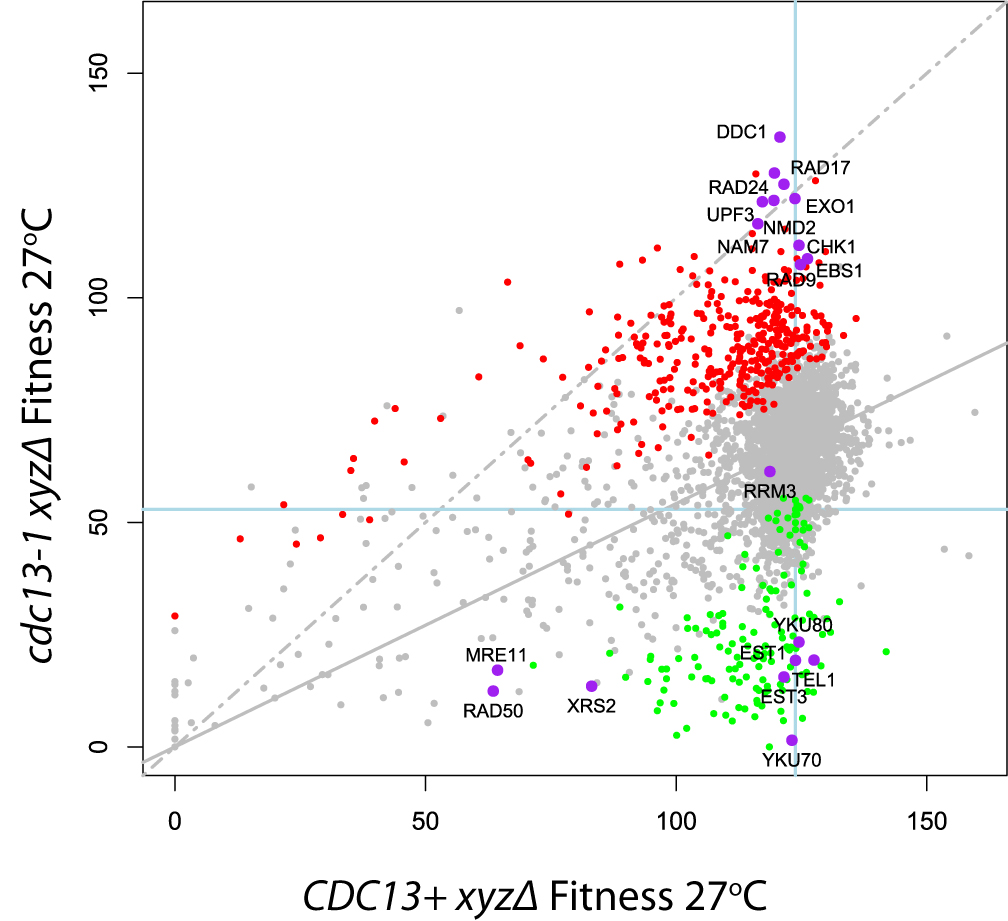
Genome-wide QFA of telomere-defective cdc13-1 strains. Strains with cdc13-1 or ura3 (CDC13+) mutations were crossed with ~4,300 other gene deletions by SGA. Fitness of the progeny was assessed by QFA at 27oC and plotted above to demonstrate suppression or enhancement of the cdc13-1 fitness defect. Each dot, grey or coloured, indicates the mean fitness (across at least 8 replicates) of a single gene deletion in combination with other mutations. Gene deletions known to affect telomere biology are labelled and coloured purple. The neutral his3 mutation is at the intersection of the blue lines. A linear regression through all points is solid grey and the 1:1 line is dashed. This vector graphics plot was generated using the interactive visualisation tool in the qfa R package. Axes labels edited in Adobe Illustrator.

